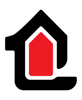
London Outdoor Solutions Logo
London Outdoor Solutions is an outdoor maintenance and mitigation company based in Durango, Colorado.
This minimal logomark for London Outdoor Solutions uses a clean, graphic silhouette to communicate the core value of protection. The design features a bold, black outer shape resembling a stylized 'L.' A subtle nod to the company name, which doubly acts as an encompassing barrier. Inside, a smaller, recessed red shape forms the symbolic protected space or house. This visual relationship directly reflects the client's services in outdoor maintenance and fire mitigation, illustrating the concept of the business safeguarding the home from external threats.
Branding Language
The design language for London Outdoor Solutions is deeply rooted in the brand's origins near Engineer Mountain in Durango, Colorado. This commitment to place is woven throughout the collateral using the local environment as a primary theme. Specifically, I've incorporated the real topographical detail of Engineer Pass for an authentic sense of location and heritage. For items like business cards and door hangers, this detail is realized through a handmade silhouette of the mountainside, which is a personal touch directly from a photo provided by the business owner to connect the brand's services to the unique landscape it serves.


London Outdoor Solutions Typography
The typeface Poppins was selected to complement the logomark's contemporary silhouette. Its geometric and clean form mirrors the minimal, modern aesthetic of the brand, while its high stroke weight provides the necessary visual density to anchor the bold logomark. I utilized a high-contrast typographic hierarchy specifically matching the weight of 'London' to the outer ring of the mark to establish a strong, cohesive connection between the type and the logomark.